June . 2020
Taking an existing brand and rebranding it
Lavazza is originally an Italy based brand established in Turin which mainly focuses on the Business to consumer (B 2 C) business model.
It’s the world’s seventh ranking coffee roaster and is the retail market leader in Italy with a market share by value of over 48% globally with about 15% share in India.
However, its brand recognition in India seems to be pretty low. Considering India to be one of the most important markets for Lavazza,
In this project, I have worked on improving the branding and marketing strategies for the Lavazza brand particularly in India.

CHANGING THE BRAND TONE

The brand tone was changed to maintain consistency throughout the brand. In the changed brand tone, the same colors have been used except with changed color values. The brand tone colors have been reduced to 3 main colors. Blue, Brown, and peach. The peach was added to give a sense of
calmness and positivity.
The imagery of coffee cups was done away with and was replaced with coffee-related illustrations to follow a more minimalistic approach.
PACKAGING DESIGN
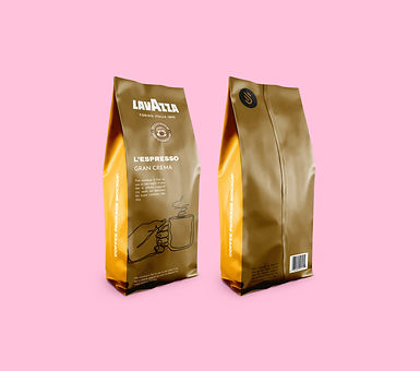
The new packaging for the “classic” Lavazza range of coffee.
Since they pride themselves over their earthy flavors I decided to highlight that, and hence focus on keeping the packaging mainly brown, with the colorful side packaging indicating the different varieties of blends they have to offer in that range.
This packaging was done for the project Tierra range of coffee. Project Tierra is a social responsibility project to improve the social and environmental conditions and production techniques of some of the coffee-producing communities.

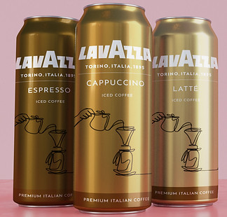
So far Lavazza has only come up with the cappuccino cold brew but here’s to hoping that they will, in the future, come up with the other two cold brews as well.
"BUSINESS BOX"


One of the promotional ideas was to convert a business card into a “business box”. It will the same size as a business card in length and width but with 1cm thickness (like that of a matchbox). Inside the box would be a sample sachet of the Lavazza coffee. These could be distributed before the launch of the Lavazza café at supermarkets to get the word of mouth.
SOcial media
This is how the flow of the website would be

Since Lavazza does not have an Instagram page for Lavazza India, I decided to work on the page layout for lavazzain myself.
These were some of the story ideas for Lavazzain page as an online brand
promotion strategy.
physical media

A newspaper ad and a coupon, which would get you a 20% discount at your local Lavazza coffee shop. This idea was to tempt the customers to actually visit the coffeeshop.

Here, i wanted to create the illusion of the brewed coffee pouring into a cup. The tagline used here is a play on words, that is brewing soon instead of coming soon.
Another idea could be having a coffee stand next to the billboard on the highway for travelers and short coffee stops.
Another ambient media approach I have experimented with is using cabs as the medium of advertisement. The coffee glass on the side of the door will be placed in such a way that when the windows roll up it gives an illusion of the cup filling up and vice versa.


